
Basketball has always been as much about aesthetics as it is about the game. The best players often earn more selling sneakers than from their team contracts. Jerseys and starter jackets have both had their moments as fashion staples. Unlike football or hockey, faces aren’t hidden behind helmets — we’re meant to see, recognize, and emulate the stars. And that means they have to look cool.
Some franchises understand that better than others. With more alternate jerseys than ever, we set out to rank all 30 NBA uniforms for the 2025-26 season. The Association and Icon editions carry the most weight, since they’re worn the most, but Statement and City Editions factor in too. What makes a uniform work?
Color scheme: Do the colors complement each other, or clash?
With those rules in mind, here’s the countdown.
30. Minnesota Timberwolves

These uniforms embody everything wrong with modern NBA design. Generic fonts, unnecessary stripes that look more soccer than basketball, and zero connection to “Timberwolves.” Swap out the wordmark and colors and these could belong to any team. The City Editions sometimes get it right, but Minnesota’s decision to abandon its flawless Kevin Garnett-era look remains baffling. Thankfully, those classics are back in rotation this year — a reminder of what the Wolves should be wearing full-time.
29. New Orleans Pelicans

The alternates prove how good New Orleans can look — the VooDoo and Mardi Gras editions have flair and cultural identity. But the standard sets? Dull and lifeless. Navy and gold overwhelm each other, the only local touch is the font, and nothing about them says “Pelicans.” This is a city with endless visual inspiration. The team should either embrace one of its bold alternates permanently or rethink the brand entirely.
28. Washington Wizards

The Wizards’ name screams for creativity, but their uniforms act embarrassed by it. The current red, white, and blue identity is essentially a watered-down callback to their Bullets era. There’s no magic, no stars, nothing unique. The Cherry Blossom alternates are the one saving grace, but otherwise, this is a team dressed like it doesn’t believe in its own name.
27. Toronto Raptors

Once the league’s most stylish franchise, Toronto has stripped away everything that made its look iconic. Gone is the purple, gone is the claw mark imagery, gone is the boldness. Now it’s bland red-and-black minimalism competing with teams that do it better. The maple leaf on the shorts is nice, but it can’t carry the weight. A sad decline from one of the all-time great designs.
26. Sacramento Kings

Purple — the color of royalty and the team’s namesake — barely features. The cursive script is awkward and flat, and the tiny crown over the “i” is practically invisible. Better than the old “SAC” uniforms, sure, but still underwhelming. The Kings have a better look in them somewhere.
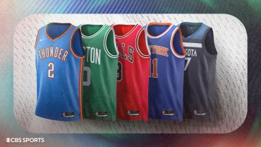
25. Oklahoma City Thunder

The Thunder have never had a strong design identity. Their uniforms remain little more than a wordmark on a blank canvas. The occasional alternates — like the Native American-inspired City Edition — show what’s possible, but the base set is consistently uninspired.
24. Indiana Pacers

Circular text almost never works, and Indiana proves it again. The trim has some racing-inspired flavor, but your eye only sees the clunky text. The Pacers’ history includes some excellent designs — the current set just isn’t among them.
23. Dallas Mavericks

Another “word on blank canvas” approach. The blue shades play well together, and the side detailing helps a bit, but the look remains generic. Dallas has consistently whiffed on alternates too, with one or two nostalgic exceptions.
22. Memphis Grizzlies

Navy overwhelms baby blue, and the only distinctive touch is the font. The alternates, though? Fantastic. The Vancouver-era jerseys and the Memphis Sounds tribute are infinitely better than the base look. The Grizzlies feel like a team afraid to fully embrace their city and history.
21. Los Angeles Clippers

The return of script is a welcome improvement over their bland 2010s look, but navy feels overused, and the charm of the old shoelace-style script is gone. They’re better than before, but still middle-of-the-pack.
20. Houston Rockets

Red and white saves these from total anonymity, but the design itself is generic. The Rockets’ bold “R” logo has never appeared on a jersey, which is a waste. Their City Editions often shine — baby blue, Chinese text, 90s throwbacks — proving they can do better.
19. Cleveland Cavaliers

The Cavs change looks constantly, and almost every past version has been better. The “V” as a net on the white jersey is clever, but the red Icon misses that detail. Inconsistent theming and endless rebrands make for a forgettable look.
18. Denver Nuggets

Like Cleveland, Denver has abandoned its best looks — the rainbow skyline, the pickaxes, the baby blues. The current uniforms are the blandest of the franchise’s history. At least the Nuggets are reviving their rainbow City Editions this year, a reminder of how good they could look.
17. Brooklyn Nets

Minimalism works here because black and white is distinct, especially next to the Knicks’ bright palette. Still more cool than creative, but the City Editions — especially the Biggie-inspired ones — show real flair.
16. Detroit Pistons

Clean and classic without being dull. The Motor City vibe comes through in the side trim, and they manage red, white, and blue better than Washington. Still, it’s hard not to miss the fire horse era.
15. Atlanta Hawks

Loud red and yellow makes these instantly recognizable. They don’t lean heavily on thematic design, but the color combo carries the day. The Hawks’ City Editions have often added extra personality.
14. Milwaukee Bucks

Forest green is perfect for a team named the Bucks, and “Cream City” alternates always deliver. The beige is less exciting, and the purple era arguably stood out more, but these are solid, on-theme jerseys.
13. Los Angeles Lakers

The Lakers’ uniforms are iconic, but the franchise has been chipping away at that legacy. They rarely wear purple, the whites have lost their tradition, and the yellow has drifted too close to highlighter. History keeps them high, but it’s time to fix the gold.
12. Phoenix Suns

After two decades of misses, Phoenix finally modernized its beloved sunburst. The design is unique, thematic, and a model for how teams can revive old concepts without being dated. A brighter purple would push these into the top 10.
11. Miami Heat

The “Heat” font is everything, with its subtle flame detailing. The “Miami” version lacks the same punch. The Vice uniforms remain among the league’s best alternates ever, though some other experiments have flopped.
10. Philadelphia 76ers

Red, white, and blue done right. The stars tie the look to Philadelphia’s history, and the Iverson throwbacks provide perfect contrast. The one nitpick: “Phila” feels awkward compared to “Philly.”
9. New York Knicks

Blue and orange are magic together, and the Knicks’ simple but bold design has endured. The crewneck switch was a downgrade from the old V-neck, but the overall look remains iconic.
8. Portland Trail Blazers

The diagonal stripe is one of the most distinctive elements in sports uniforms, and the red-black-white combo always pops. Each revision has simplified things a bit too much, but the Blazers’ look will always be cool.
7. Utah Jazz

After years of disasters, the Jazz returned to their 90s mountains. The palette isn’t as vibrant, but the design recaptures the magic. Drop the “Utah” wordmark and embrace “Jazz” to fully complete the look.
6. Orlando Magic

Finally back to their roots: pinstripes and stars. The redesign revives the team’s 90s magic, though the blue patch on the black Statement Edition clutters what should have been their definitive jersey. Still, a huge improvement.
5. Golden State Warriors

Circular text works here because it surrounds art — the Bay Bridge — not just numbers. The Warriors are masters of local branding, and the nickname “Golden State” gives them added distinction. Other franchises should take notes.
4. Charlotte Hornets

A cultural icon from the 90s, the Hornets are back in teal pinstripes, and the subtle details — hornet silhouette, stinger letters — elevate the look. Nostalgia done right.
3. San Antonio Spurs

Minimalism at its finest. The spur in the “U” is all the design they need, sharp against black, silver, and white. No frills, just timeless and clean.
2. Boston Celtics

Nothing fancy — just green and white — but these uniforms are history. They’ve barely changed in 70 years, and that’s the point. When the Celtics take the floor, it feels like tradition itself.
1. Chicago Bulls

The most iconic jersey in basketball. Red, white, and black, bold fonts, outlined numbers, and an enduring design unchanged since Michael Jordan’s heyday. The City Editions usually land, and the black pinstripes only add to the legacy. Cool, simple, unforgettable.
0 Comments